WHAT?
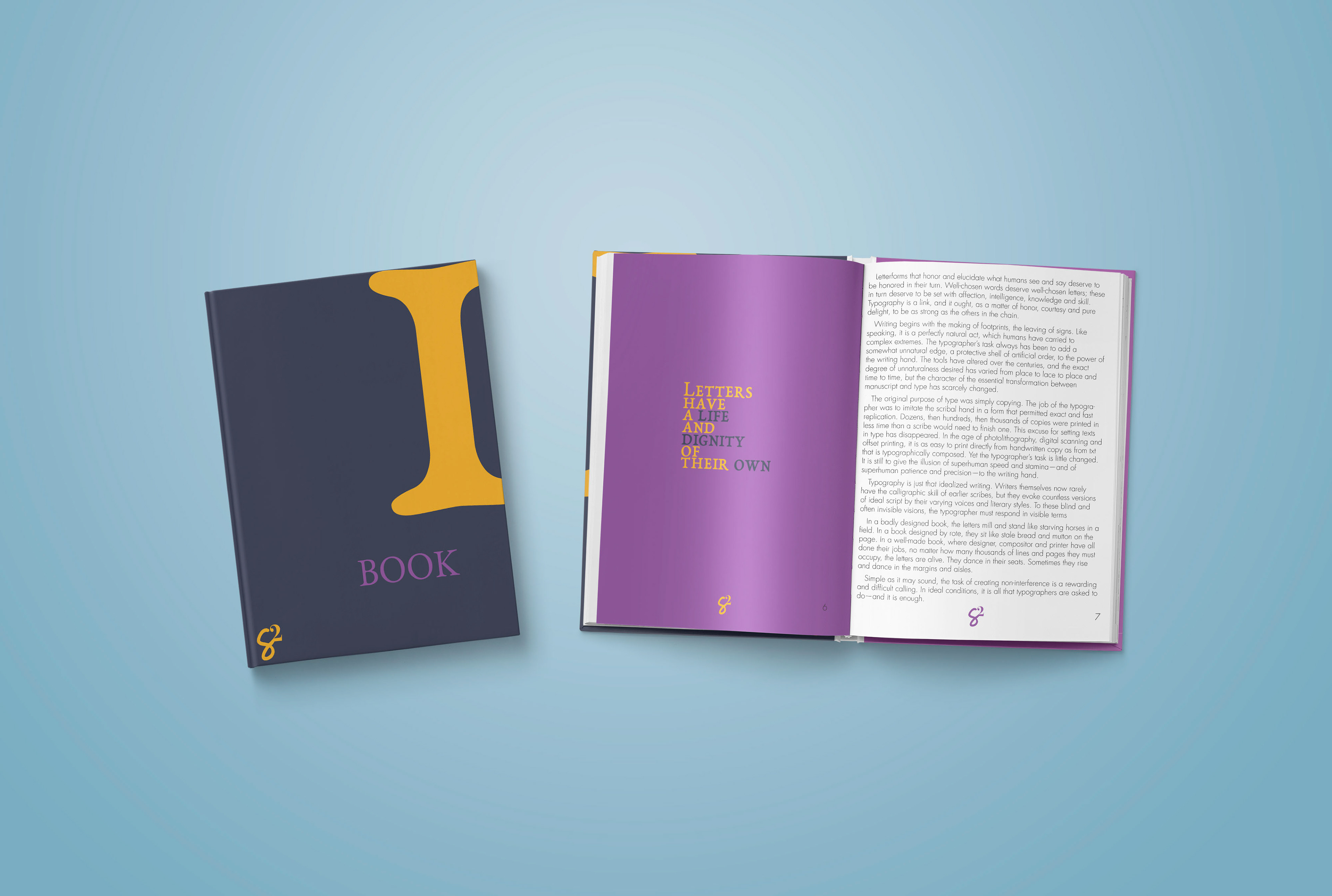
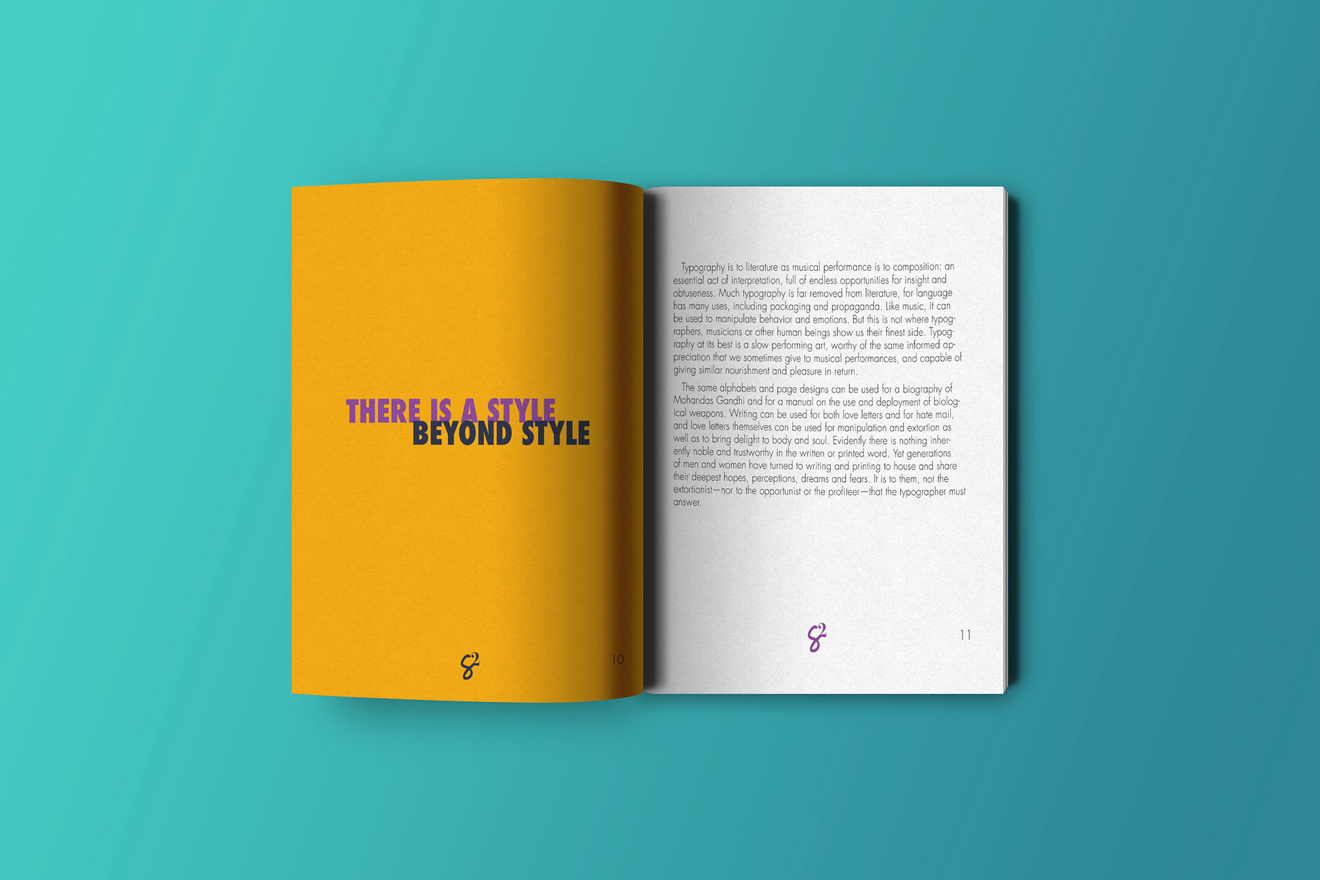
Book One is all about the principles of typography. This creative rendition helps to teach and celebrate typography – 1st edition was black & white and 2nd was in color.
WHY?
Book One’s 1st edition highlights the creative use of type within the limitations of ready content. It uses the great possibilities type gives designers to bring a fresh view on the principles of typography. Additionally, it plays on the black and white aspect of information design. Book One’s 2nd edition takes it one step further as it brings color to the mix. It shows not only the flexibility available when working with type, but it also shows the engagement between type, color, and information design.
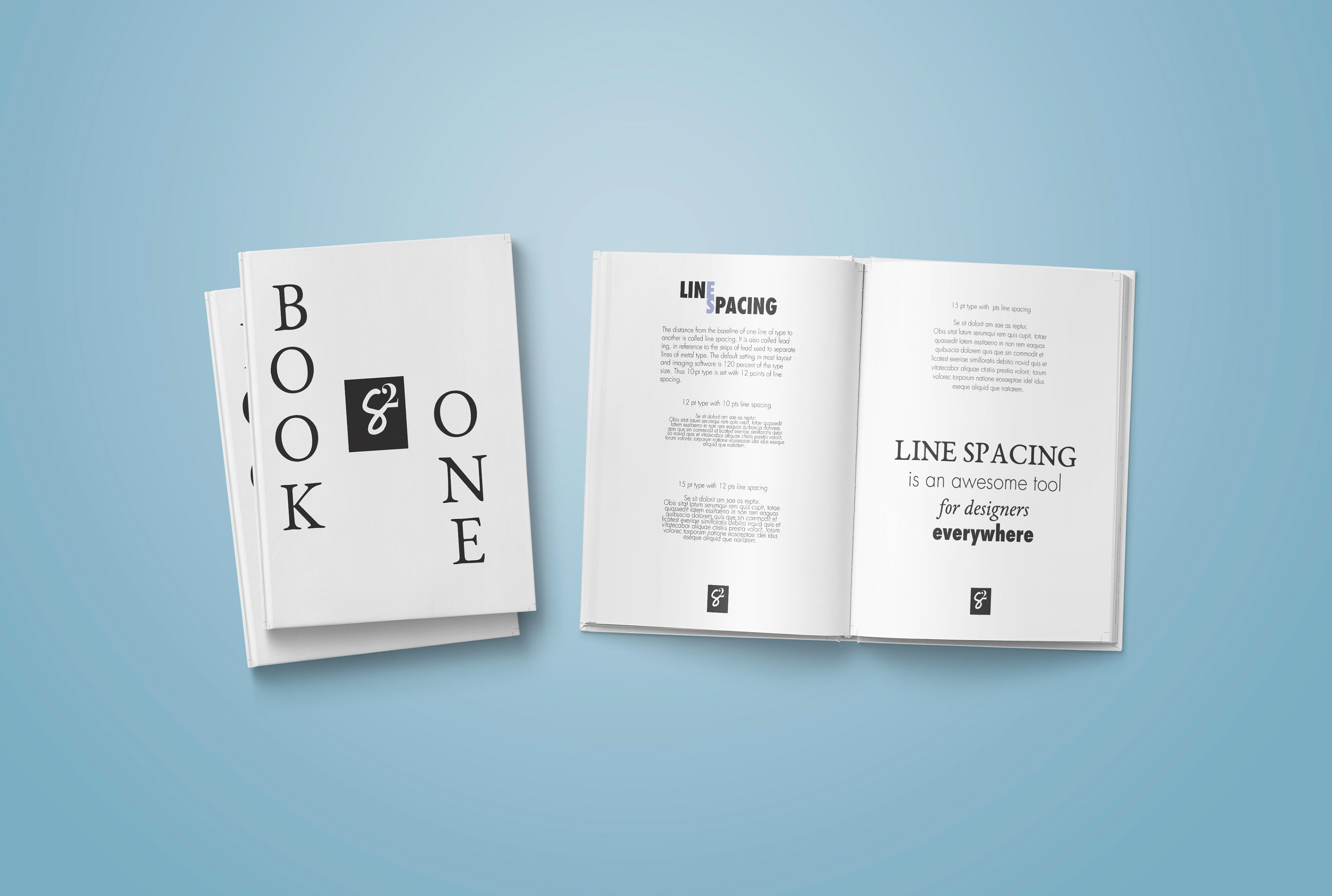
HOW? Book One was born from the S2 letterform project. Typography is a constant both for communicators and designers and its principles deeply impact information design across the board.