WHAT?
This infographic was designed when the Pipeline first came under consideration by the Obama Administration. During an internship at the Community and Food Justice Coalition in Oakland,CA we launched a campaign on the pipeline awareness and this infographic was one of the pieces of such campaign.
WHY?
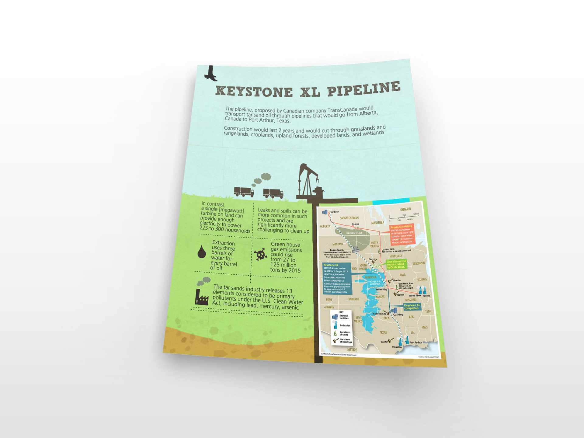
This infographic was designed to inform the public on some of the important climate change related topics when it comes to the Keystone XL Pipeline. It was released during the “open comments” period.
HOW?
It focused on using facts that would relate to users that are considered about climate change and the future developments in the United States. Additionally, this infographic used facts that could also relate to people who were looking for more information on the Pipeline.